Design system maintenance playbook
Once the system is in place, every change has a "right place" to land. This doc maps common situations to the correct tier or file. The guiding question for any change: "What's the smallest layer I can touch to achieve this?" Touching a higher layer than necessary creates duplication; touching a lower layer than necessary creates blast radius.
Change matrix
| Situation | Where to change | Why |
|---|---|---|
| Full rebrand (new color palette) | Primitive tier ramps | Semantic mapping stays; every component inherits new colors automatically. |
Swap a role (e.g. primary becomes teal instead of black) | Semantic tier mapping | Primitives untouched, other roles unaffected. |
| Add a new shade in an existing color family | Add to primitive ramp, then expose via semantic if needed | Keep ramps complete; only promote when a real role needs it. |
| Change global corner roundness | --radius base token | Derived --radius-sm/md/lg scale automatically. |
| Adjust spacing rhythm across the site | Spacing scale tokens | Component code doesn't change. |
| Change motion feel (faster / softer) | --duration-* and --ease-* tokens | All animated components inherit. |
Add a size variant to Button | New variant inside button.tsx (via cva) | Variants are component-level concerns. |
| Change typography pairing (new font) | Font import + --font-sans / --font-serif tokens | Base styles in @layer base flow through. |
| Adjust heading scale | --text-* tokens, then base layer if mapping changes | One source of truth. |
| Add a new shared primitive | shared/ folder, with className override | Don't put one-off components here; wait until reuse appears. |
| A shared component now has 3+ variants | Refactor with class-variance-authority (cva) | String-concatenated conditionals become unreadable past 2 variants. |
| A shared component is only used in 1 page | Move it back into that feature folder | shared/ should reflect actual reuse, not aspirational reuse. |
| A new component needs a color not in semantic tier | First ask: is this really a new role, or a reuse of an existing one? If new → add semantic token. | Resist inventing component-level colors before exhausting semantic options. |
| Dark mode looks off for one component | Check semantic token mapping in .dark first | The component is usually correct; the token mapping is wrong. |
| Token unused for 6+ months | Delete it | "Just in case" tokens pollute the design surface and confuse contributors. |
| Adding a third-party component (date picker, etc.) | Wrap it in a thin adapter that uses your tokens | Never let third-party defaults leak into the design surface. |
Rebrand procedure (full color change)
The rare-but-important case. With the tier structure in place, this should take under an hour:
- Create the new primitive ramps alongside the old ones (don't delete yet).
- Update the semantic mapping to point to the new primitives.
- Test the
/designroute in both light and dark modes — every token, every component. - Spot-check 3–4 real pages with different layouts.
- Delete the old primitive ramps once nothing references them.
If step 4 reveals broken components, the problem is almost always a hardcoded color that escaped semantic-tier discipline (e.g. bg-zinc-100 instead of bg-muted). Fix the component, not the tokens.
Adding a new token — decision tree
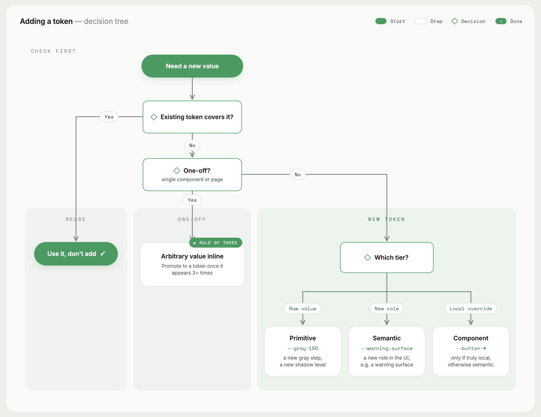
Rule of three: don't tokenize until the same value shows up three times. Premature tokenization creates abstract names with no clear meaning.
When to break the system
The system serves the product, not the other way around. Legitimate reasons to bypass:
- A genuinely unique surface (a marketing landing page with a one-off illustration treatment). Build it inline; don't pollute shared tokens.
- A vendor component that comes with its own design language and can't be retheme-d. Isolate it visually (its own card/section) so the inconsistency reads as intentional.
- A throwaway experiment. Skip the system entirely; you'll throw the code away.
Don't bypass for:
- "It's faster this time" — it isn't, on the second use.
- "The token doesn't quite fit" — fix the token or add one. Don't hardcode around it.
- "This component is special" — every component thinks it's special.
Health checks (quarterly)
Once the system is live, run these periodically:
- Grep for arbitrary values (
-\[) — should be near-zero. - Grep for hardcoded colors (
#[0-9a-f],rgb(,oklch(outsideglobals.css) — should be zero. - Visit
/designin light and dark — anything broken? - Count unused exports in
shared/— delete or document. - Diff
globals.cssagainst 3 months ago — has it grown? Why?
These take 15 minutes and prevent slow rot.