Design system setup
A step-by-step playbook for bootstrapping a design system in a new project. The goal: a foundation that is easy to maintain, easy to extend, and cheap to rebrand.
Mental model — token tiers
Before touching code, internalize the three-tier token hierarchy. Every decision below maps to one of these tiers:
| Tier | Example | Changes when… |
|---|---|---|
| Primitive | --gray-500, --brand-600 | Almost never. Raw palette. |
| Semantic | --background, --primary, --border | You rebrand or remap roles. |
| Component | --button-background, --card-shadow | A specific component needs override. |
When you decide to "swap the entire color palette", you only edit the primitive tier. When you decide "primary should now be teal instead of black", you only edit the semantic tier. Components never reference primitives directly — that's the rule that makes rebrands cheap.
Phase 1 — Foundation
Step 1. Write design principles (before any code)
Spend 15 minutes answering, in writing:
- Personality: editorial / playful / corporate / brutalist? → drives font choice, radius, motion intensity.
- Density: airy or compact? → drives spacing scale.
- Contrast level: muted or bold? → drives color range and border strength.
- Motion appetite: still or lively? → drives duration scale and easing choice.
Step 2. Define primitive color tokens
Create the raw palette as ramps, not individual colors. Any color you pick will soon need a hover state, a disabled state, a subtle background, and a ramp has those shades ready before you ask.
/* oklch(L C H) — lightness 0–1, chroma 0–~0.37, hue 0–360° */
--gray-50: oklch(0.985 0.002 90);
--gray-100: oklch(0.967 0.003 90);
--gray-200: oklch(0.923 0.004 90);
--gray-300: oklch(0.869 0.005 90);
--gray-400: oklch(0.708 0.006 90);
--gray-500: oklch(0.556 0.007 90);
--gray-600: oklch(0.439 0.007 90);
--gray-700: oklch(0.371 0.006 90);
--gray-800: oklch(0.269 0.005 90);
--gray-900: oklch(0.205 0.004 90);
--gray-950: oklch(0.145 0.004 90);

--brand-50: oklch(0.97 0.014 255);
--brand-100: oklch(0.932 0.032 255);
--brand-200: oklch(0.882 0.059 255);
--brand-300: oklch(0.809 0.105 255);
--brand-400: oklch(0.707 0.165 255);
--brand-500: oklch(0.623 0.214 259);
--brand-600: oklch(0.546 0.245 262);
--brand-700: oklch(0.488 0.243 264);
--brand-800: oklch(0.424 0.199 265);
--brand-900: oklch(0.379 0.146 265);

/* optional: --accent-*, --success-*, --warning-*, --danger-* */
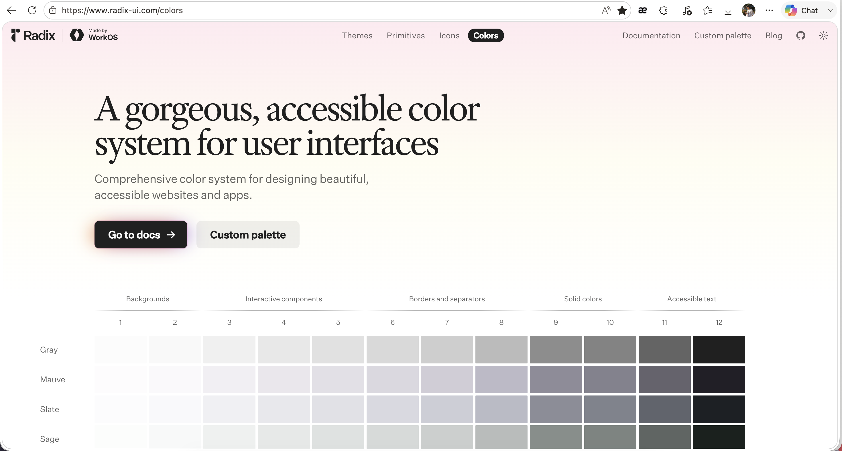
Source: Radix Colors
Why OKLCH over hex/HSL: OKLCH describes a color with three knobs — L (perceived lightness), C (chroma, how saturated), H (hue angle). Because L follows how the eye perceives brightness, you can tune a color by feel: raise L and it looks lighter by that much, whatever the hue. HSL's lightness doesn't work that way (yellow and blue at the same L look nothing alike), and hex can't be tuned by hand at all.
Support is no longer a concern: every modern browser parses oklch(), and Tailwind v4's default palette ships in it.
Done when:
- Gray ramp has at least 9 steps spanning near-white to near-black.
- Brand ramp has at least 5 steps.
- Steps look evenly spaced when laid out side by side.
Step 3. Define semantic color tokens
Map primitives to roles:
--background       → gray-50
--foreground       → gray-950
--muted            → gray-100
--muted-foreground → gray-500
--border           → gray-200
--ring             → gray-400
--primary          → gray-950 (or brand-600)
--primary-foreground → gray-50
--destructive      → danger-500
Why: components reference these names, not primitives. The paired *-foreground tokens guarantee every surface has a readable text color.
Done when:
- Every primitive used in semantic mapping is consciously chosen, not "looks fine".
- Each background-ish token has a paired foreground.
- No component you plan to build needs a color that isn't in this list.
Step 4. Define non-color tokens (in one pass)
Set up the full scaffold, even tokens you won't use today:
--radius (base) + scale: --radius-sm/md/lg/xl/2xl
--shadow-xs/sm/md/lg/xl
--duration-fast/base/slow      (e.g. 140ms / 250ms / 400ms)
--ease-standard/in/out/expo
--z-base/dropdown/sticky/overlay/modal/toast
--tracking-tight/normal/wide/widest
Why upfront: tokens added later tend to be one-off magic numbers in component files, never promoted to the system. Defining the scaffold once forces consistency from the first component you build.
Why derive radius from a single base (--radius-md = calc(var(--radius) * 0.8)): changing one number reshapes the whole UI. Useful when reconsidering personality (sharp → soft).
Done when:
- All five token families above exist.
- No component will need to invent its own duration, shadow, or z-index.
Phase 2 — Typography
Step 5. Choose fonts and define the type scale
Pick:
- 1 sans (sans-serif: plain strokes, no "feet") — UI, body
- 1 serif (small "feet" at stroke ends) or display (built for large sizes, lots of character) — headings, optional but adds personality
- 1 mono (monospace: every character the same width) — code, fallback to system stack is fine
Define:
--text-xs / sm / base / lg / xl / 2xl / 3xl / 4xl
--leading-tight / snug / normal / loose
Why a modular scale (ratio ~1.2–1.25): scales built on a ratio look harmonious; ad-hoc sizes (13px, 15px, 17px, 19px) look noisy. Pick a ratio that matches your density principle — tighter ratio (1.125) for compact UI, wider (1.333) for editorial.
Why leading is separate from size: line-height doesn't scale linearly with font-size. Body text wants 1.6–1.75; display text wants 1.1–1.25. Coupling them prevents bad pairings.
Done when:
- A sample page with
<h1>through<h4>and 2 paragraphs reads comfortably without per-element class overrides. - Code blocks render in mono with subtle background.
- Selection color is set (small detail, big polish signal).
Step 6. (Optional) Prose styles for long-form content
If the project has blog/MDX/markdown:
- Create a
.proseclass with max-width (~65–75ch), tuned line-height, spaced headings, styled blockquotes, lists, hr, code. - Keep it in a separate file (
prose.css) — it grows fast and cluttersglobals.css.
Why a separate class: prose rules are aggressive (they style raw <p>, <ul>, etc.). Scoping them to .prose prevents leaking into UI components that also use those tags.
Done when:
- A sample article renders with comfortable rhythm.
- No prose rule affects UI outside
.prosecontainers.
Phase 3 — Components
Step 7. Install shadcn primitives — only what you need now
Resist installing everything. Add as you go. Common starter set:
button, card, separator, dialog, tooltip, sheet, sonner, skeleton, badge, avatar, accordion.
Why on-demand: shadcn copies source into your repo. Unused components rot — they reference tokens you've since renamed, accumulate dependencies, and add noise during search.
Done when:
- Every installed primitive is used somewhere within the first week of building.
Step 8. Build layout primitives
Create reusable, unstyled-but-spaced wrappers:
Shell/Container— max-width + horizontal paddingStack—flex flex-col gap-*Cluster—flex flex-wrap gap-*Grid— preset grid templatesSection— vertical rhythm wrapper, often with<Separator />integration
Why: 80% of layout code is the same five patterns. Naming them removes a class-string-soup that would otherwise repeat in every page. Composition becomes readable: <Section><Stack gap="lg">...</Stack></Section>.
Why flex-first, not margin: margins collapse, leak through containers, and create spacing that depends on sibling order. Flex gap is predictable and only affects siblings inside the flex container.
Done when:
- A feature page can be assembled without writing
flex flex-col gap-*strings inline. - No layout primitive carries color/typography — only structure.
Step 9. Build shared domain primitives
Small, brand-flavored components used in multiple pages: Kicker, Tag, ArrowLink, BackLink, etc.
Why separate from ui/: shadcn ui/ components are generic and may be regenerated. Shared primitives are yours — they encode brand voice (kicker style, link arrow animation). Mixing them breaks the mental model.
When to promote something to shared: it appears in 2+ pages with the same shape. Until then, leave it inline.
Done when:
- Each shared primitive accepts a
classNameoverride (always last argument tocn()). - No shared primitive hardcodes layout context (e.g.
mt-8). Spacing is the caller's job.
Step 10. Build feature components
Page-specific compositions: Header, Footer, HeroIntro, NowSection, etc. These compose Phase 3 layers and are allowed to be opinionated.
Why this layer is the last: building features before primitives means inventing primitives reactively, creating duplication. Building primitives without features means over-engineering. Phases 1–2 must be solid; Phase 3 layers build bottom-up.
Done when:
- No feature component reaches for an arbitrary value that isn't a token.
- Adding a new page reuses existing primitives ≥80% of the time.
Phase 4 — Documentation & Tooling
Step 11. Create a living /design route
Build an in-app page (or Storybook, if team >1) that renders:
- Color tokens — swatches for every semantic token, side-by-side light/dark.
- Type scale — sample text at every size, with leading.
- Spacing, radius, shadow — visual chips for each step.
- Components — every primitive and shared component, all states (default/hover/disabled/loading/dark).
Why in-app over static docs: it's real code referencing real tokens. It can't drift. Static markdown documenting hex codes will be wrong within a month.
Why this page pays off: when adding a new component, you check /design to see what tokens exist. When debugging visual inconsistency, you compare against /design. When onboarding someone, you send the link.
Done when:
-
/designexists and is linked from a dev-only menu (or simply bookmarked). - Every token has a visual representation on the page.
- Every shared component appears with at least its default state.
Step 12. Set up lint and formatting
- ESLint +
eslint-plugin-tailwindcss— enforces class ordering, flags contradictions and arbitrary values that have canonical equivalents. - Prettier +
prettier-plugin-tailwindcss— auto-sorts classes on save. - TypeScript strict mode.
- (Optional) Stylelint for any handwritten CSS.
Why: discipline is fragile. A linter that runs on save catches drift before it ships. Without it, "canonical syntax" becomes a rule that's followed for two weeks and forgotten.
Done when:
- Saving a file auto-sorts Tailwind classes.
- An arbitrary value with a canonical equivalent (
p-[16px]vsp-4) triggers a warning.
Step 13. Write a CONTRIBUTING.md (or CLAUDE.md / AGENTS.md)
Document the conventions that aren't obvious from reading code:
cn()usage and argument order (base → conditional → override).- Import order.
- Folder layout (
ui/vsshared/vslayout/vs feature). - When to create a shared component vs inline.
- How to add a new token (which tier, what naming pattern).
- Spacing rule (flex-gap preferred, margin only for prose flow).
Why: without these notes, future-you and anyone else on the project — human or AI — will quietly drift in different directions.
Done when:
- A new contributor can write a component matching house style without asking questions.
Related
- Maintenance playbook — how to evolve the system once it's in use.
- Anti-patterns — common mistakes that erode the system over time.